
DFW International Airport - Mobile Website Design
An intuitive mobile website design allowing users to navigate Dallas Fort-Worth International Airport. DFW International lacks a native app for their users; as a solution the mobile website is an efficient tool for travelers.
Overview

My Role
Lead UX Researcher: I was one of 4 people involved in our project. As the Lead Researcher I was responsible for the interview process, data collecting, and synthesizing processes.
Client
DFW International Airport
Sprint
2.5 Weeks
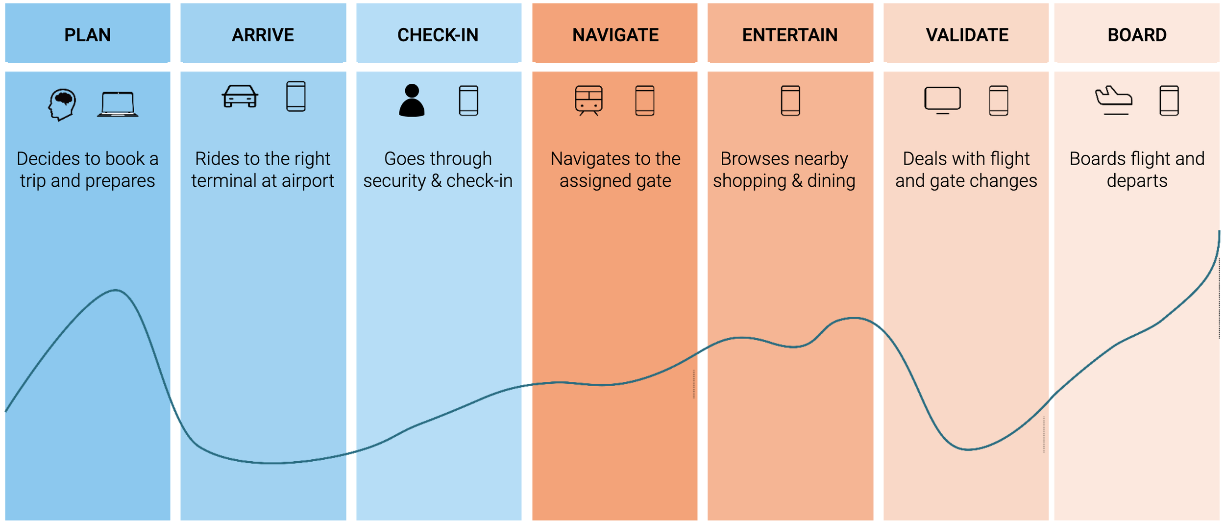
The Problem
Our initial data reported that visitors of the DFW Airport were distraught and frustrated when it came to navigating the layout of the area. DFW International is a highly complicated business that houses multiple terminals and gates. Our users insights helped us create an efficient model for a mobile friendly website that is centered on easing the pain-points of the user journey.
Discover
-
We compared user experiences of other businesses primarily focused on customer services. This included examples from other airports such as the Singapore Changi International Airport, the Northwestern Med Spa, and a large scale stadium event.
-
We dissected first-hand user reviews based on public Google reviews. Our team gave a PASS, FAIL, or ATTENTION NEEDED category for each defined heuristic.
-
34 responses were collected across multiple types of airport users in order to manifest our core needs, wants, pain-points and user goals.
-
We conducted 5 user interviews on individuals who had recently traveled through an international airport. We were able to identify further needs and wants when navigating an airport.
-
The final persona was an accumulation of our research insights. With our ideal user in mind the journey through an airport became clear and focused.
Research Insights
-
1. Navigation
Users generally report having a negative experience when navigating airports. Users prefer a digital solution when tasked with exploring a new environment.
-
2. Flight Information
The most important information for users is their gate information. This is accessed mainly through digital channels (e.g. mobile device or FIDs).
-
3. Security
Users reported they don’t like long wait times at security checkpoints. The average wait time was 20 minutes amongst flyers.
-
4. Familiarity
Users recognize airport processes but require further assistance once inside the establishment.
-
5. Transportation
Individuals utilize ride-sharing or other similar services in order to arrive at the airport.
-
6. Entertainment
It is important for users to stay active and occupied as they are waiting on their plane to arrive. Users enjoy visiting shops and restaurants if they have enough time before their flight departure.
Ideate
We spent one week accumulating data on our users. Once we synthesized our ideas we were able to concentrate our efforts on delivering a complete project encompassing our methodologies. The design phase was time sensitive and so efforts were primarily focused on our main structures of user pain-points.
Design
Our design was highly influenced by simplicity and efficiency. We decided that users on the go would appreciate having all their options listed in a format that was familiar and inviting. As to not ask more from the users, we pushed away from designing a native app and focused primarily on the intuitiveness of the site in respect to the interactive maps on a mobile website platform.
Design Considerations
Navigation & Processes
In general, flyers have not had the best experiences when trying to find their way around airports. Through various research we found that our users heavily relied on digital devices in order to navigate the airport. We took into account these pain-points and behaviors of our users; thus, we utilize everyday devices such as smartphones and digital signs in order to guide the users on their way.
Services & Amenities
Users need to be able to find information on restaurants and shops that meet their needs - when they need it. From our research, we found that almost all of our users arrive at the airport with a significant amount of time to spare prior to departure, and most prioritize staying entertained at the airport.
Flight Updates
Knowing that passengers need an easy way to find their flight information and updates, we created a solution that includes an intuitive flow to find this information on our website and through email updates. We also wanted to incorporate in-person signage and QR codes to direct passengers to our easy-to-use flow.
Prototype Testing
-
![]()
Home Page V1
Our initial home page was centered on the interactive map found on DFW’s website. Issues arose when users were primarily clicking on the map rather than our navigation buttons.
-
![]()
Home Page V2
This version of our home screen utilized our buttons and placed less emphasis on the map. Our buttons remained simple and clean.
-
![]()
Home Page V3
Our final screen. We decided to use this version of our homepage based on aesthetic of buttons and placement of the map. We finalized this page by replacing “Get to DFW” with a “Drop-Off Zone” option instead.
-
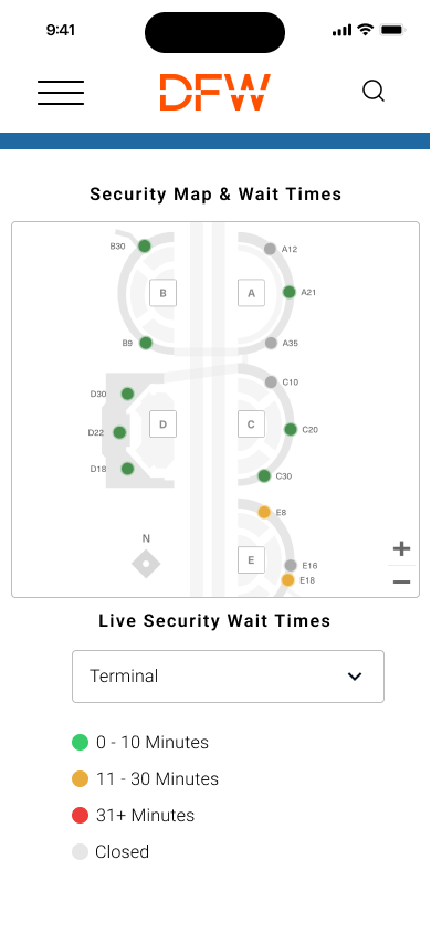
![]()
Security Page 1
Our security page was reworked in order to have easy to interpret filters that made the specific checkpoints interactive, so that users can easily find accurate wait times.
-
![]()
Security Page 2
-
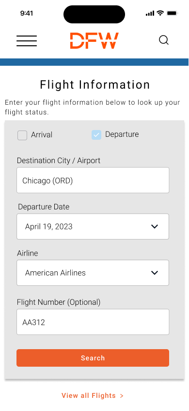
![]()
Flight Search 1
When asked to locate their flight information, users did not find our original solution helpful in finding this information, so we made a search tool for users to search for their specific flight instead of having to scroll through a long list. The new design makes searching for a flight much more efficient.
-
![]()
Flight Search 2
-
![]()
Shopping & Dining V1
In our usability testing, we found that most users could intuitively navigate our restaurants page using the information provided. We didn’t initially have menu links or mobile ordering available and most of our testers pointed that out. So we added it in our final prototype.
-
![]()
Shopping & Dinning V2


Testing Insights
While we were originally confident that our design pinpointed problem areas, our initial solution confused most of our participants. In response to this, we created a new homepage layout and revamped aspects of our mobile website layout.
Testing Takeaways
Users were initially confused on where to click on the homepage. 2 out of 4 were able to correctly pinpoint “How to get to DFW”
Majority of users were able to correctly navigate to the security gates
3 out of 4 users were able to find some form of entertainment while exploring our web design
3 out of 4 users successfully located information regarding the status of their current gate
Final Results
Our final results indicated that users were more than willing to utilize a mobile website that had access to necessary tools relating to DFW International. Our team focused on the user experience and made changes as necessary to our prototypes throughout the process. We had a high success rate in our final deliverables in accordance to: finding security gates, terminals, and other airport activities. While satisfied with our prototype, I am still willing to make further design modifications in regards to AAA accessibility and even further intuitiveness.