The Healing Chicago - Mobile App Design
Challenge: At the outset of this project, The Healing primarily utilized Instagram and group messages as their primary communication channels. While many remain engaged in the group chats, it's worth noting that some individuals find it challenging to keep up due to the rapid accumulation of messages. Existing members have conveyed their desire for a centralized hub to effortlessly access the latest updates regarding upcoming events and interactions with other subscribers.
Solution: As The Healing continues to grow and extend its reach, the organization has recognized the importance of adapting and developing customized tools for their users. In this case, focus has shifted to the realm of digital interactions. Our team was tasked to design a mobile app in order to curate activities and deliver impactful content that specifically resonates with and serves the needs of Black and brown men.
Outcome: The app's design serves as a comprehensive hub for The Healing, offering open channels for discussing events and facilitating meaningful conversations about members' experiences. It also provides a user-friendly, up-to-date events calendar for effortless planning and registration.The Healing app is currently in production, and as we approach its launch, we anticipate gathering valuable data to assess its post-launch performance.
My Role: UX Researcher

Sprint: 3 Weeks

Defining the Problem

The Healing Chicago is an expanding business in which local members are participating in exercises that benefit both the body and mind. Members of The Healing are highly interested in building community; as such there is a growing need for communication, alignment, and fellowship. Our task was to launch the beginnings of a design for a mobile app that allows users to interact with individuals within their area in order to foster healthy relationships and grow the interpersonal connections found through the organization. The app must be able to balance the habits of The Healing’s user base while also advancing on a social-interaction element.
Foundations of an App - Market Madness & Competitive Analysis
-
![]()
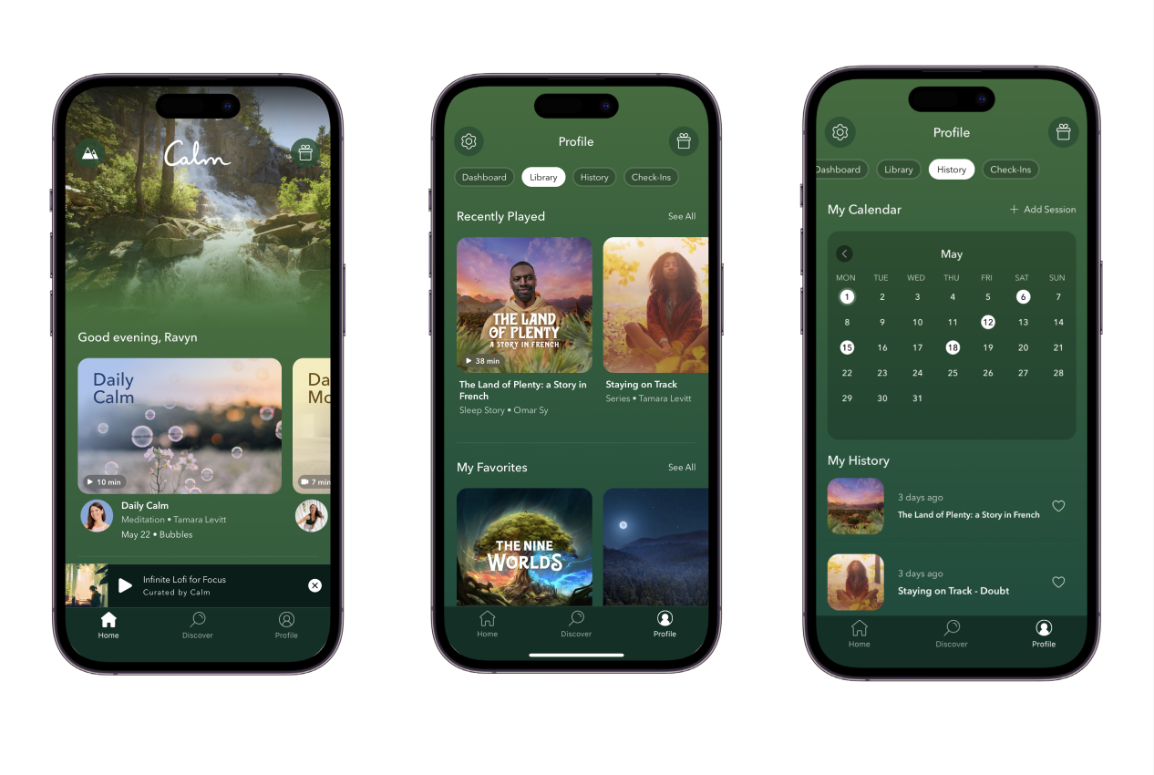
Calm
The original design concept for The Healing Home page drew significant inspiration from Calm, particularly in terms of the personalized home page and media carousels. Additionally, emphasis was placed on replicating Calm's effective use of primary and secondary navigation; which contribute to an organized and concise information architecture.
-
![]()
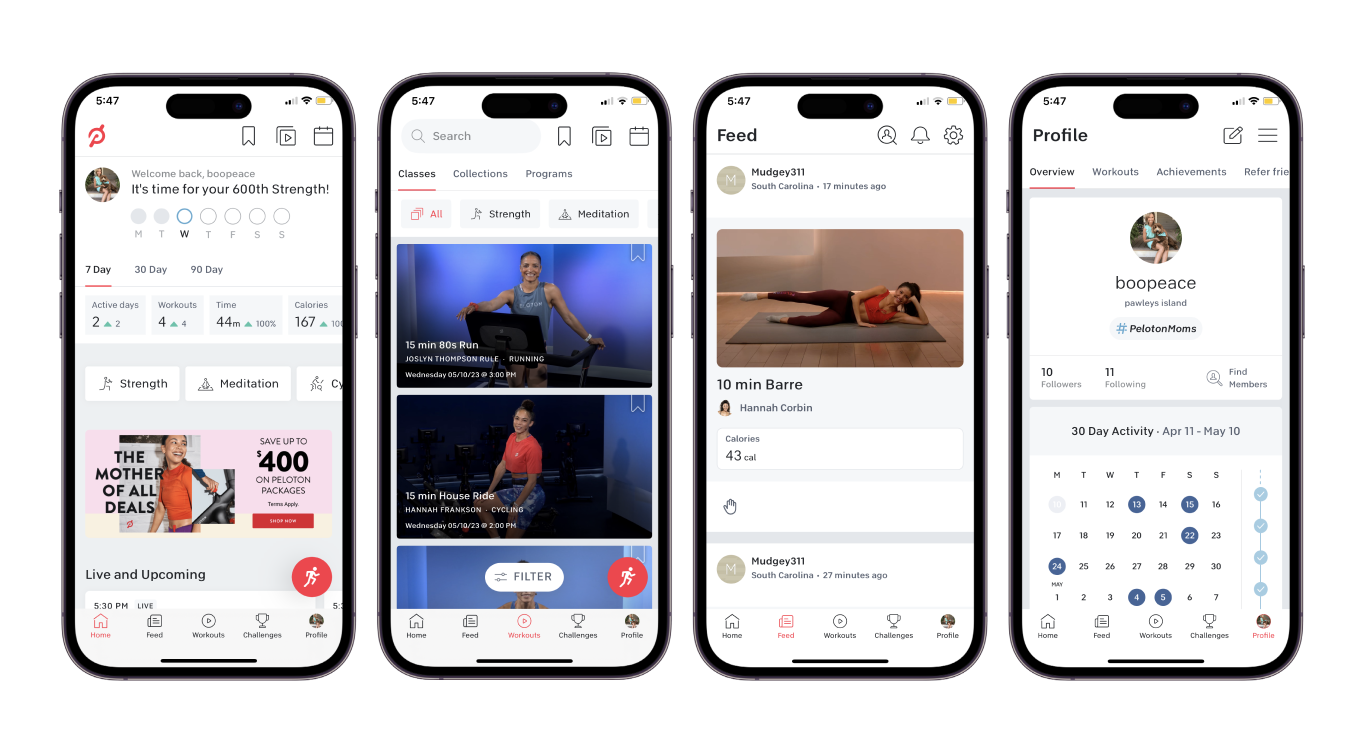
Peloton
During the analysis of Peloton's design, a trend was observed regarding the implementation of horizontal scrolling for secondary navigation. The sense of community and achievement found in the Peloton app, particularly in features like the 'Feed' where members can share completed workouts, and the 'Profile' where users can track events and milestones, piqued interest and consideration for adoption.
-
![]()
Equinox+
In the analysis of Peloton's design, a prominent trend was identified in the implementation of horizontal scrolling for secondary navigation. Furthermore, the Peloton app showcased a strong sense of community and achievement through features such as the 'Feed' where members share completed workouts, and the 'Profile' where users track events and milestones.
-
![]()
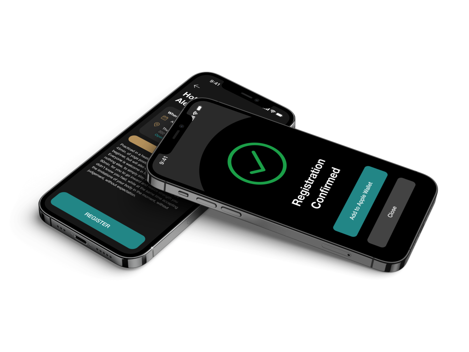
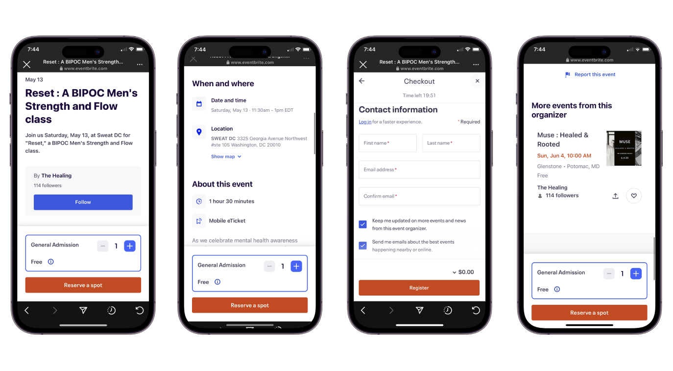
Eventbrite
The Healing currently utilizes Eventbrite for event sign-up purposes. The interface of Eventbrite, particularly the implementation of iconography and the straightforward 'Checkout' field, has been identified as a source of inspiration. The aim is to ensure that users can easily comprehend and navigate the new app, fostering a quick and seamless event sign-up process.
Member Interviews

-
Regarding community, the participants expressed a high level of appreciation for the strong sense of fellowship fostered by The Healing. They emphasized the enjoyment derived from connecting with fellow members both during and outside of events, often by engaging in activities such as having meals together. Additionally, the community discourse, particularly within the group chat, was highlighted as a significant aspect. It was noted that the group chat provided a more personalized experience compared to other media platforms, allowing members to engage in diverse discussions.
-
The team conducted four member interviews based on the current pool of users found at The Healing. This was crucial in defining the primary audience (inherently being The Healing’s population).
-
The client was specific in needing a native app used intuitively by their current members in order to keep track of events and personal mental or physical goals while at the organization.
-
Interviews were conducted over the course of two days via Zoom or Google Meets.
-
Events - The Healing began as a weekly yoga session during the 2020 pandemic. It is now reaching beyond its scope and offers a variety of programs that are continuously developing.
Mobile App - Users find that a mobile app would be useful in order to compartmentalize subjects and their personal lives.
Updates - Current updates are found online through Instagram. This is okay for some, but not all users are on the app or are not able to see all updates in a timely manner.
Engineering Information & Design of Lifestyle
Members need an immersive health and wellness experience through accessible information on upcoming events and open communication channels between their users. Through this, The Healing will continue to maintain and grow their community.
Therefore, focus shifts to 3 main points of research: How may we…
Help users continue to build deeper and meaningful relationships?
Help The Healing personalize their user’s wellness journey?
Display a schedule of upcoming events and programming?
Wireframe Sketching & Aligning Style

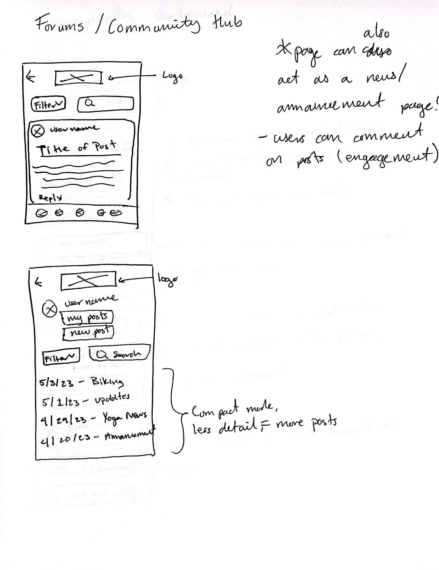
Sketches
The initial stages of conceptualizing The Healing mobile app involved a meticulous examination of successful elements employed by competitors. Through this process the team placed significant emphasis on prioritizing functionality, providing valuable user resources, and maintaining a cohesive company aesthetic to cater to users across different age groups.
By adopting a professional and objective approach, the team ensured that user experience remained at the forefront of our considerations. The integration of successful competitor elements, combined with a focus on functionality and aesthetics laid the groundwork for the development of a user-friendly and visually appealing app for The Healing.


Color & Text Guide
By carefully considering the color scheme and typography, The Healing app strives to create a professional and engaging experience for its users, reflecting the app's objectives and reinforcing its visual elements.
In terms of typography, the team has opted for Helvetica Neue as one of the preferred text styles. This choice is driven by its legibility and functionality, which align with the selected competitor objectives and web page elements. Helvetica Neue not only exudes elegance but also ensures high readability, enhancing the overall aesthetics and usability of the app.
The chosen color palette is intentionally selected to evoke the desired mood and enhance the user experience within the mobile application. The use of blue symbolizes inner peace and relaxation, creating a sense of safety and comfort for users as they navigate and familiarize themselves with the app. This particular shade of blue is carefully chosen to align with the overall journey and objectives of the members.
Designing Responsive and Intuitive Screens
-
Ease-of-Access
Our design offers a familiar experience to individuals who are accustomed to using health apps.
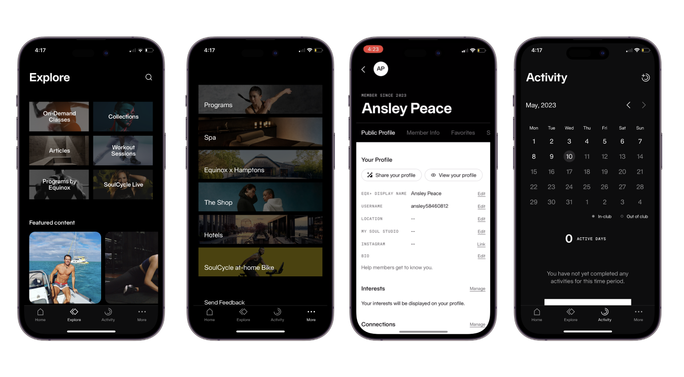
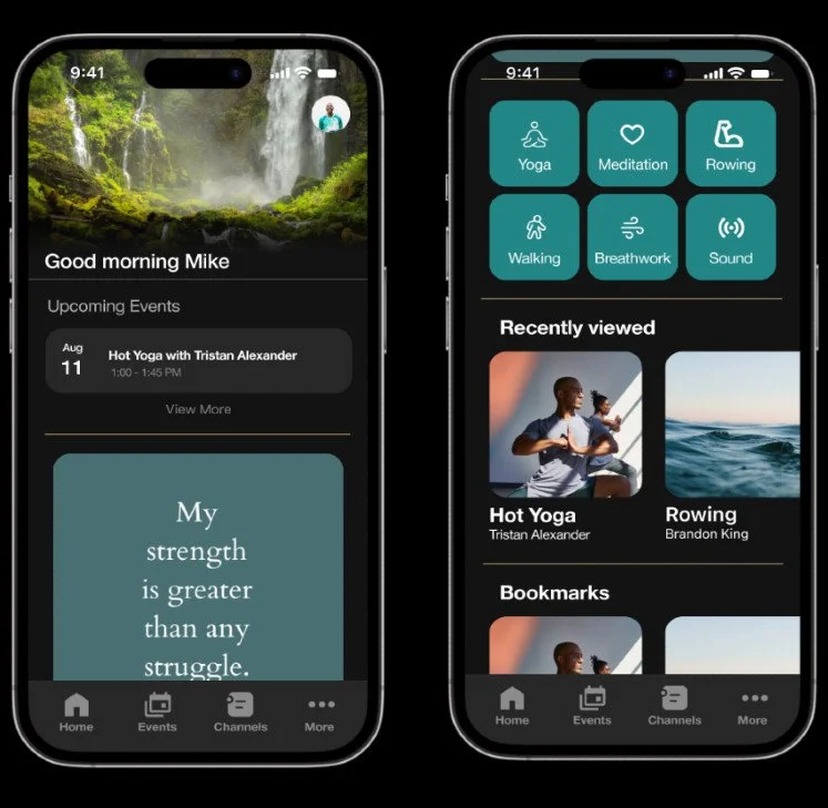
The Home page of The Healing app was designed to incorporate a personalized touch.
In designing the event previews, we prioritized displaying the most pertinent information, such as the date, time, and title. User interviews indicated this data is what members typically expect to see when browsing event listings.
-
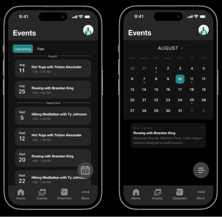
Events
To enhance accessibility, we implemented both calendar and list views for Events, allowing users to switch between the two through a toggle button located in the bottom right corner.
To align with the interface of Eventbrite, we provided members with the option to view both upcoming and past events, offering a comprehensive perspective on the app's event history.
-
Channels
User research provided insights into the significance of community interaction for members of The Healing. By recognizing the limitations of existing communication channels, we designed a space within the app where all members could engage in community discourse with various sub-categories.
We implemented a secondary navigation bar to access the different channel categories.

User Outcomes of Initial Wireframes
-
Six users familiar with using mobile health apps
These users were found outside of The Healing network in order to avoid user bias.
-

All users completed the upcoming events task
Users were asked to find and navigate the “Events” page from the Home screen.
-
All users completed the signing up for event task
When tasked with signing-up for a specific event, users were repeatedly successful.
-
All users returned to the home screen successfully
Participants were asked to return to original landing page for ease-of-access operation.
-

Two users completed the chat with members task
The “Channels” page was to be used in order to communicate with various users at once.
Insights of User Testing
Home Page - Users relayed that the homepage is well planned out. Users noted that the design did not include the company logo.
Events - Users were able to register for an event and were given the ability to save the event information directly to their mobile device.
Channels - Communication was accessible, however most users noted that they had slight troubles navigating the specific functions of the page.
Users were confused of the term “Channels” as the communication hub.
6/6 users were able to complete 3 tasks such as finding correct navigation pages or call-to-action buttons.
Only 2/6 users were able to properly navigate the “Channels” function; thus revealing flaws in our design.
Future Iterations - The Healing Chi
Build out remaining pages (profile, media)
Change Channels name to something easily understood
Add onboarding screens to familiarize users with navigation (especially in Channels)
Add event price to Event Listing page
Add active/default states to navigation bar elements
Design a light mode interface + style guide
Design abbreviated logo, or redesign logo entirely