

The Healing Chicago Mobile App Design
The Challenge: The Healing is a growing community invested in creating fellowship amongst their users. As the organization expands, board executives would like to provide users with a simple and intuitive way for peer-to-peer communications, event organization, and personal progress assessments. Members of The Healing want to have access to personalized materials such as resources and user profiles/dashboards.
The Solution: In our ongoing collaboration with The Healing, the team has successfully refined the initial wireframes, placing a strong emphasis on expanding upon existing concepts and introducing a strategic reorganization during the product development phase. With this perspective in mind, the key objectives for this stage encompass enhanced accessibility, information structuring, intuitive user experience, aesthetic alignment, and tailored customization options
The Outcome: The tentative Healing app will be a centralized hub for users. The Healing has taken into account user needs and client wants in order to deliver a product centered on developing, nurturing, guiding, and tracking progress of members.
My Role: UX/UI Designer
Sprint: 4 Weeks (Part-Time)

Defining Scope

The Healing Chicago represents a growing enterprise, where local participants engage in activities designed to foster holistic well-being, nurturing both body and mind. The members of The Healing are deeply committed to fostering a sense of community. As the team had developed previous progress with the company, we were committed to amplifying previous design and creating new pathways for a full experience at The Healing.
Original Design Frames
The team crafted a user-centric system, characterized by its simplicity and intuitive design, dedicated to seamlessly directing users toward their desired objectives. Our wireframe development process drew inspiration from a comprehensive analysis of health and wellness applications, including Peloton, Equinox, Eventbrite, and the Calm app. Distinctive features from each of these underwent refinement to integrate into the blueprint tailored for 'The Healing.'
The principles guiding this project revolved around user familiarity, functionality, and fostering a sense of self-accountability. We equipped users with the indispensable tools needed to navigate 'The Healing's' core functionalities. However, as our journey through the development phase deepened, our comprehension of both our members' needs and our organizational aspirations grew exponentially, catalyzing further enhancements to the platform.
Home Screen


Page Features:
Event information
Self-filled user information
Donation option
Cost of event
Confirmation
Page Features:
Monthly calendar view
Event list view (toggle)
Mini event description
Page Features:
Upcoming events
Daily affirmation quote
Workouts/Practices
Recently viewed
Bookmarks
Event Register
Event Screen

Page Features:
Registration confirmation
Add to wallet feature
Confirmation
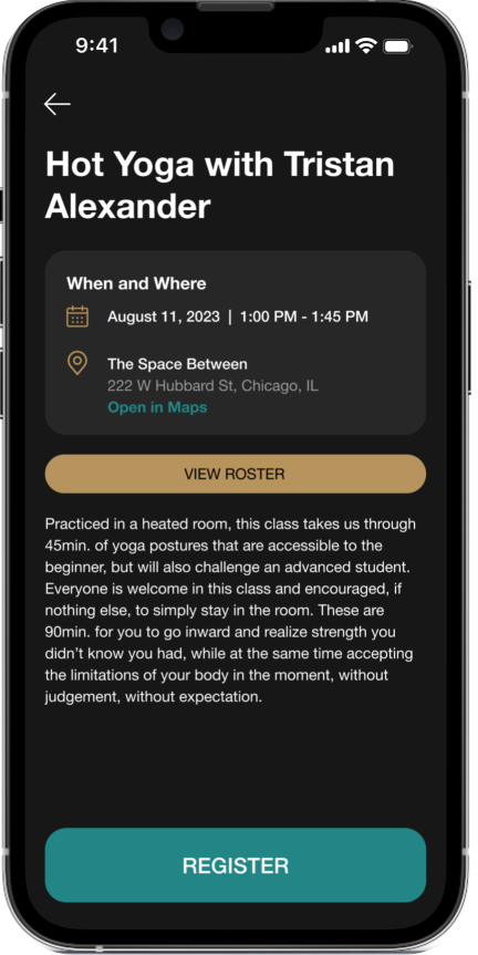
Page Features:
Event information
Open maps option
Roster of participants
Event registration
Back button
Event Sign-Up
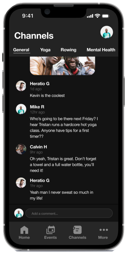
Page Features:
Community chat
Channel selection
“Add a comment” feature
Channel Screen
Insights of Usability Testing
Home Page
Users have given positive feedback on the homepage, mentioning its effective layout and organization. However, it's worth noting that the company logo is missing from the design.
Events
Users have had a smooth experience registering for events, and they appreciate the option to save event information directly to their mobile devices.
Channels
While communication is readily accessible, some users have encountered minor challenges when trying to navigate specific features on this page.
It's important to highlight that a few users found the term "Channels" somewhat confusing as the central communication hub.
Task Completion
In terms of task completion, a positive note is that all six users that were tested successfully accomplished three tasks, including finding the correct navigation pages and call-to-action buttons.
However, only two out of the six users were able to navigate the "Channels" function correctly, revealing some design flaws that require attention.
** Testing participants who have had previous exposure to wellness/health apps. **
Refining Designs
Building Additional Pages and Sophistication
The next step is to expand our website by creating the remaining pages, specifically the profile and aligning on aesthetics.
Simplify "Channels" Name
Considering a name change for the "Channels" feature to make it more user-friendly and easily understandable.
Onboarding Screens for Navigation
To help users get familiar with the platform, especially the revamped "Channels" section, we're planning to introduce onboarding screens that guide them through the navigation process.
Event Listing Page Enhancements
Enhancing the Event Listing page by adding event prices, making it easier for users to understand the cost of attending events.
Navigation Bar Improvements
Working on improving the navigation bar by adding active and default states to its elements, ensuring a smoother user experience.
Light Mode Interface and Style Guide
In response to user feedback, designing a light mode interface and creating a style guide to maintain a consistent and visually appealing design across our platform is critical in usability practices.
Logo Design Considerations
Exploring options for The Healing’s logo, including designing an abbreviated version or completely redesigning it to align better with an evolving brand identity.

Reflecting and Setting New Focal Points
Given insights from past studies, it's essential to prioritize user experiences. Using our previous How Might We statements:
HMW Help users continue to build deeper and meaningful relationships?
HMW Help The Healing personalize their user’s wellness journey?
HMW Display a schedule of upcoming events and programming?
While the original concepts shaped our design, new challenges have taken center stage during the ongoing process:
HMW Assist users in personalizing their experience at The Healing?
HMW Provide guides, resources and encouragement within the app?
HMW Create engagement and focus on member retention on the app?
Re-Designed Framework
With the aid of our newly acquired data, the team successfully evaluated the requirements of both clients and users, leading to the redesign of an intuitive format tailored to our audiences. These frames are being considered as part of the final outcome for the app.
On-boarding Screens: Designed with the intention to direct users towards relevant programs, classes and information once completed.

Home Screen: Redesigned for a simple flow - enhanced by a new iteration of the navigation bar located at the bottom of the screen. In addition a dark/light mode preference was introduced for accessibility.

Registration Page: Listing all necessary information regarding consumer selection.

Events Listings: Developed a platform listing current or past events and an option to switch to a monthly calendar view.

Profile Page: Profile was designed to have a slide feature in order to view a personalized review of workouts, sessions, and self-interests.


Reflections
This project represents a continuation of our initial efforts, where we revisited and refined our designs to align more closely with the standards dictated by consumer and client needs. Drawing on valuable insights gained from initial user testing, we made significant enhancements to personalize the user experience. Positive feedback greeted advancements such as the revamped profile design, enriched home page features, and optimized navigation flow. The Healing stands as a testament committed to fostering healthy experiences for both body and mind, all while maintaining a strong sense of unity and organization.
We take pride in contributing to communities in need, particularly in our focus on supporting BIPOC men. Our team is excited about the foundation we've laid and the potential for our developments to foster even deeper interactions among members. Looking ahead, our future iterations will prioritize further refinement, ensuring alignment with user testing insights and consistent branding across both the app and company website.